Sometimes after a company has been around the block for a while, the messages they originally wanted to send to the public no longer match the direction of the business. As companies grow, morph, mature, and change, the messaging remains the same. Rebranding is a great option to make a company relevant once again. Every year, we have many clients approach us looking for ways to rebrand their business. Here are some of our most recent projects.
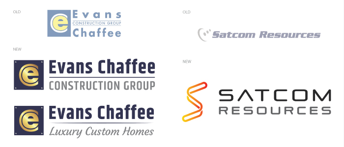
-Evans Chaffee: Since 1998, Evans Chaffee Construction Group has been renowned for their stellar commercial spaces. However, the group also specializes in luxury custom home construction. Because of this, Evans Chaffee needed to rebrand their company to be recognized as the premier commercial and luxury construction company in the Vail Valley. This was accomplished by designing complementary new logos that represent the core competencies of the company.
-Satcom Resources: When you think of satellite communications, what are some words that pop into your head? We are guessing technical and overcomplicated. This is exactly why Satcom Resources approached Avid to help rebrand their business as the one stop shop for satellite communications in an industry that is constantly evolving. The solution? A new logo that is sleek, sexy, and designed to show the fluidity of their processes which makes the experience as easy as possible for the customer. #makesatellitecommunicationssexyagain
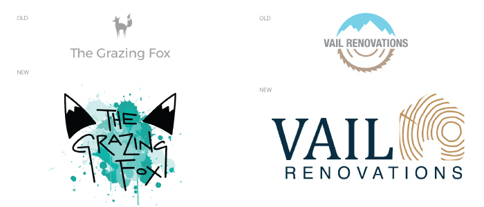
-Vail Renovations: Vail Renovations is a construction company that specializes in renovating spaces, with a talent for woodwork. To tie these elements together, the design pulled inspiration from blue prints and natural wood texture. What next on the agenda? Banging out an engaging new website design – stay tuned!
-The Grazing Fox: When The Grazing Fox first started, the owner decided to test her creativity by using free online tools to create her own branding materials. Due to sudden increased, exposure, the owner chose to give her brand an overhaul with a more professional look and feel. The first step was to redesign the logo. The owner wanted to feature her unique handwriting, but also utilize the fox motif. She also wanted to include energetic elements and loved how the watercolor splash reflected how fun the products are. Once the logo was complete, the design elements were used to establish a new business card design, a custom email template, gift cards, menus, and stickers to promote the business.

