Lost Identity Beverage Co
- branding
- product labels
- website design
- web development
Lost Identity Beverage Co. (LibCo) found their identity in bringing formerly “lost” drinks into a modern spotlight. Now, the Lost Boys encourage beverage enthusiasts to find their own identity through LibCo’s unique and classic take on shrub and tonic flavors. All shrubs and tonics are crafted traditionally, gluten-free, vegan and non-alcoholic for those with a sense of adventure.
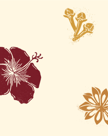
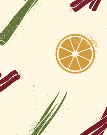
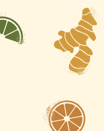
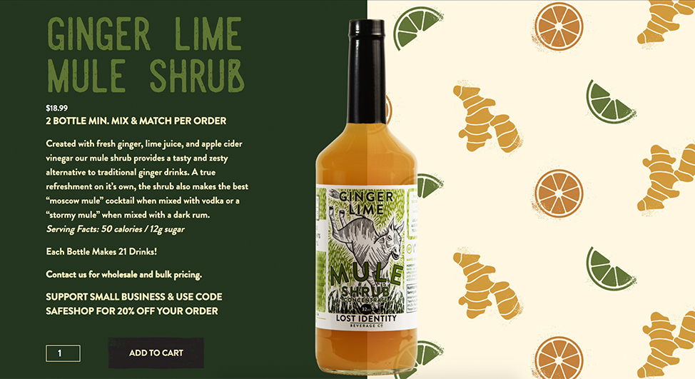
Our design team created unique woodcut patterns to suit the intricacies of each flavor and give a style nod to relief printing, a classic technique in printmaking. Inspiration for the woodcut patterns of the ingredients came from the bottle art originally designed by Ethan Harrison.
HOMEPAGE DESIGN
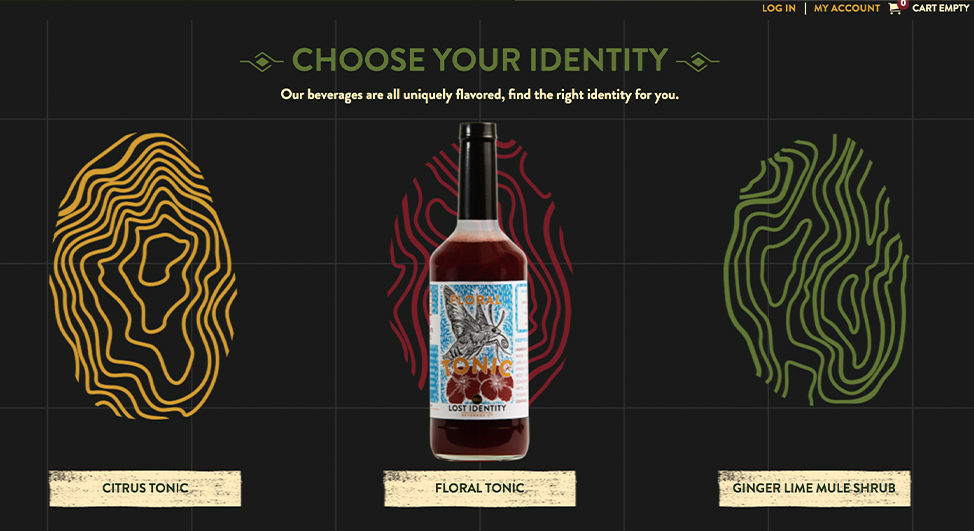
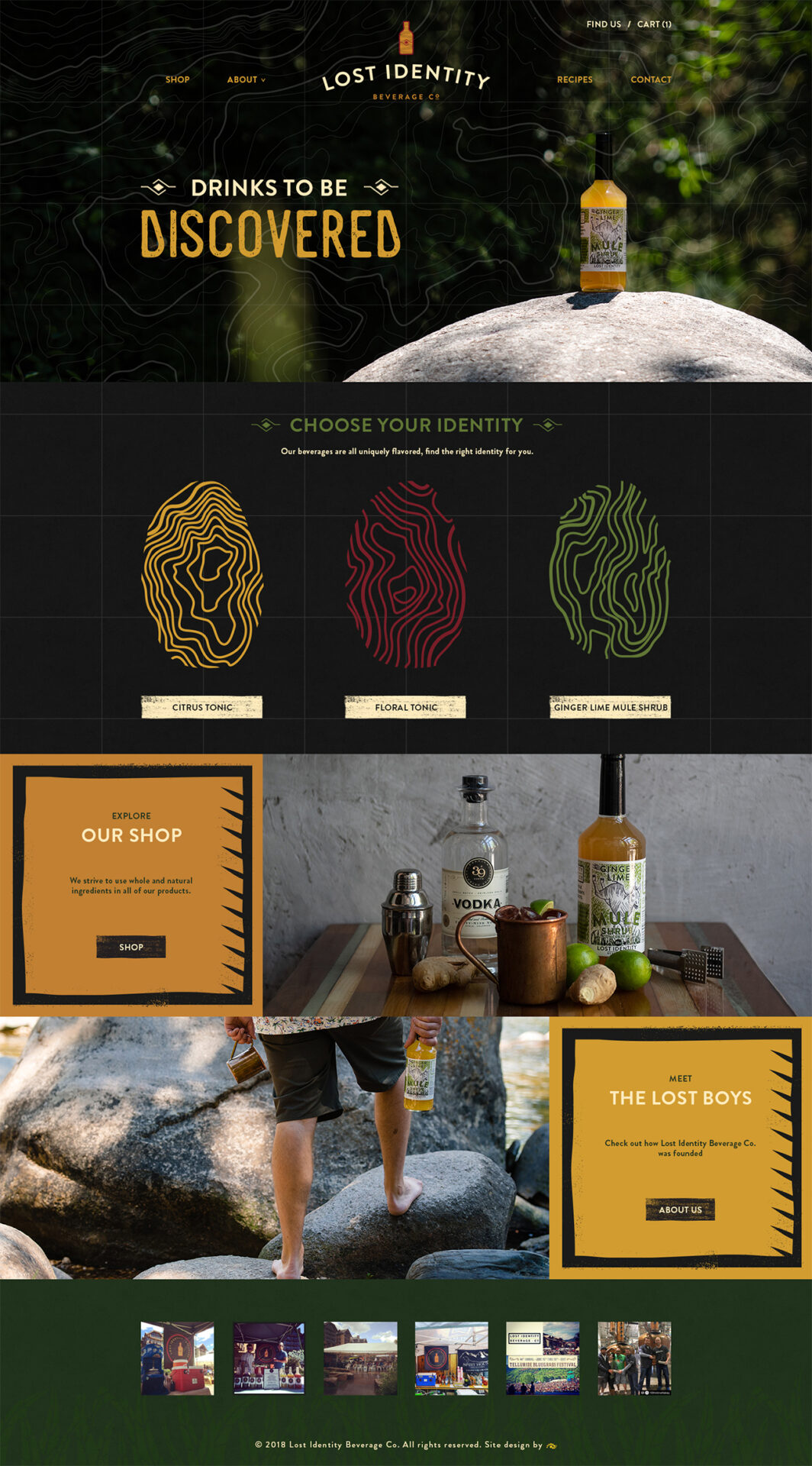
The home page takes users on an expedition that ends with discovering a new favorite beverage. Topographic patterns reference the “lost” theme with custom topographic fingerprints that signify the unique flavor characteristics of each product. The woodcut patterns are integrated into button styles and callout borders.
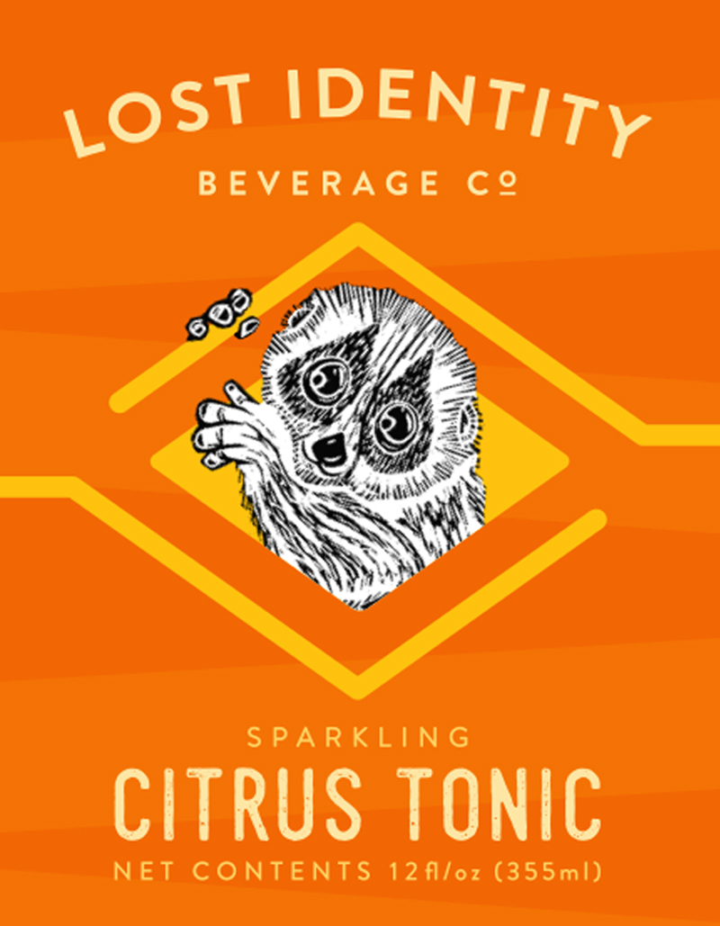
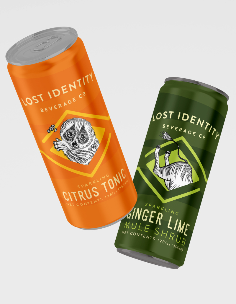
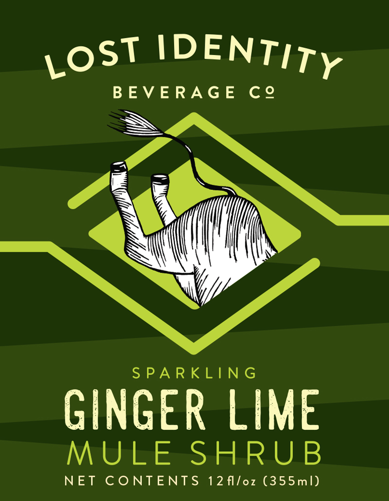
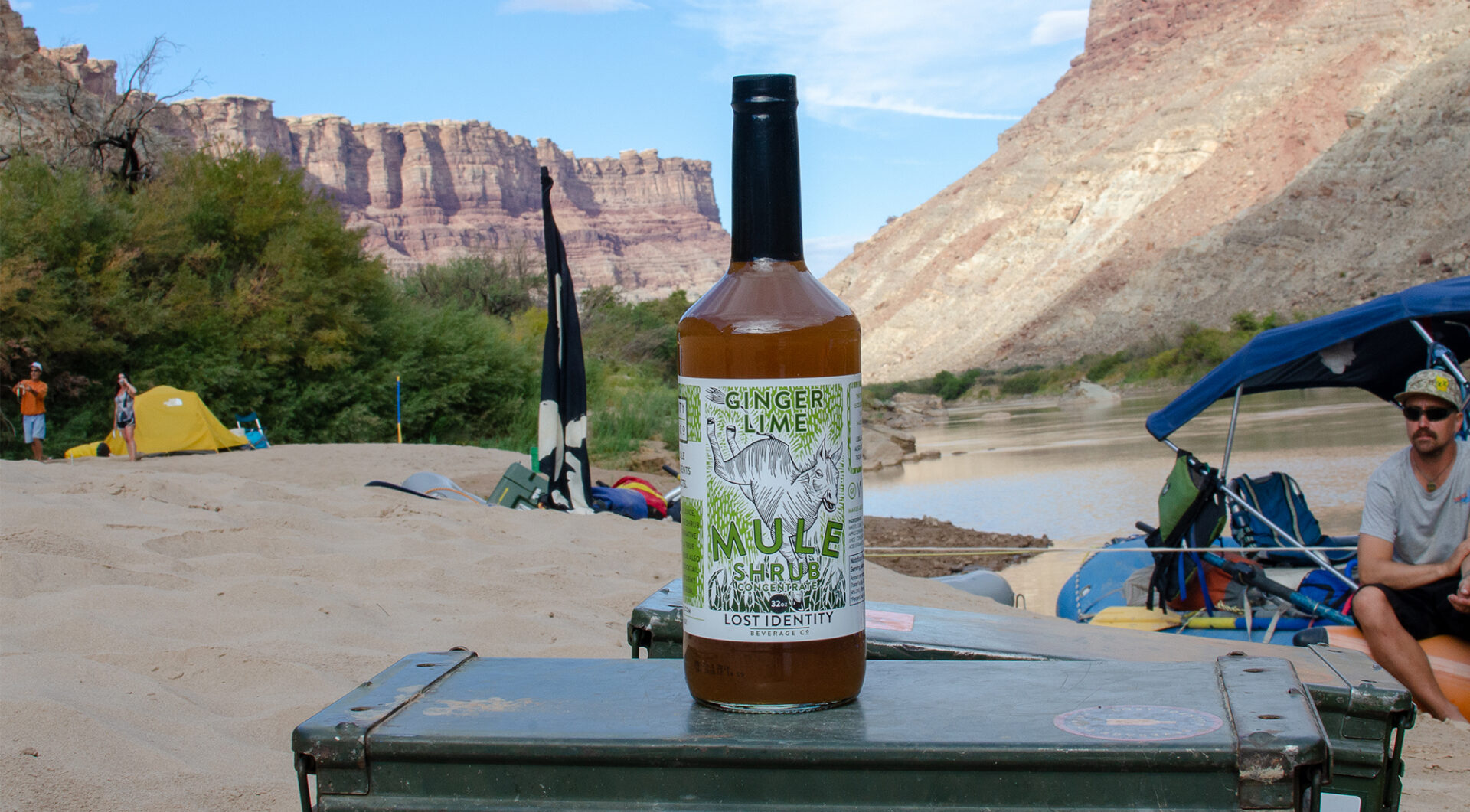
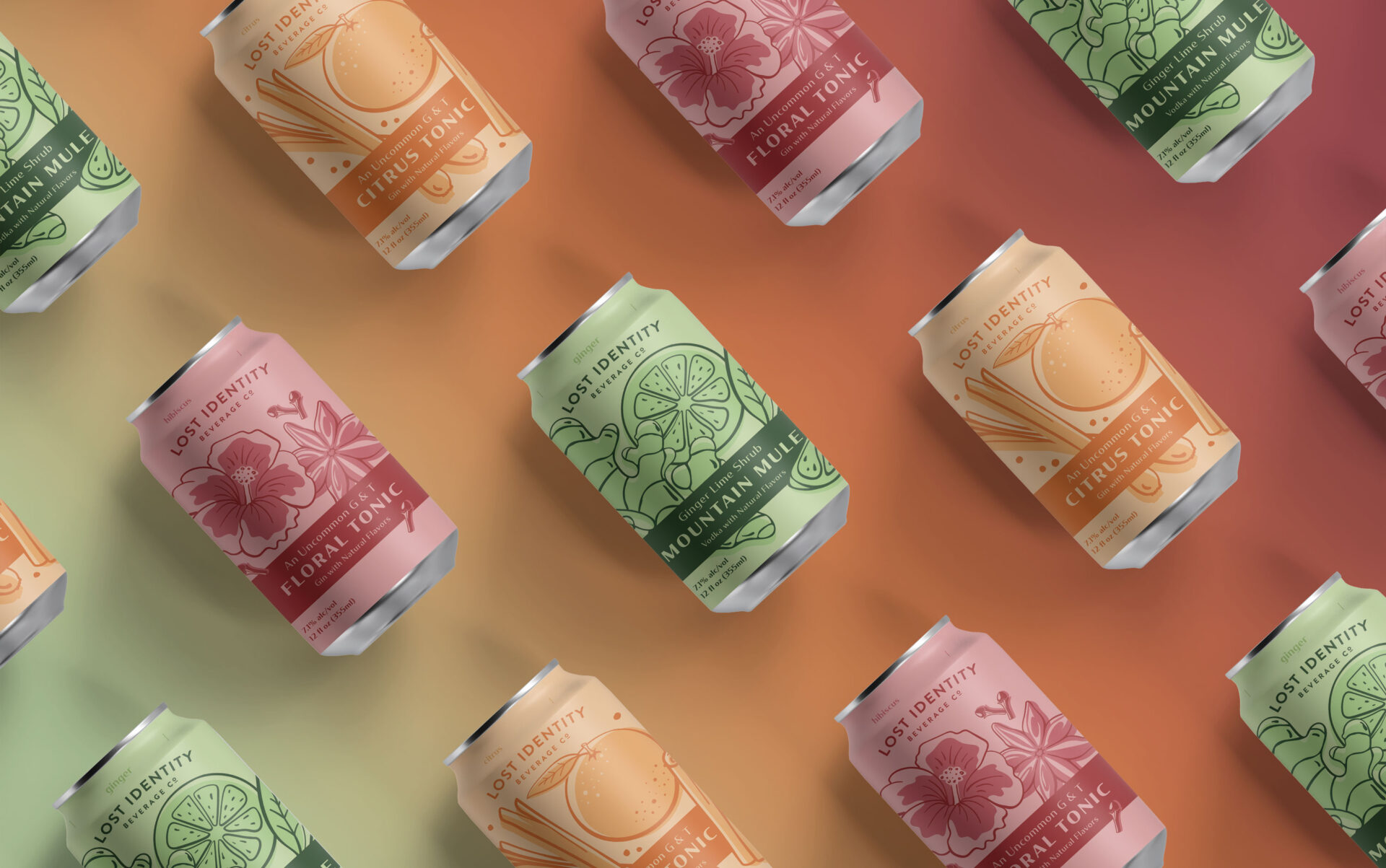
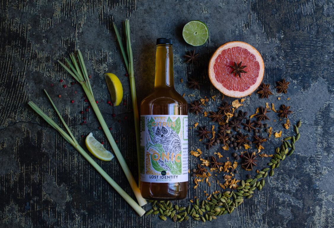
We went with eye-catching, vibrant color schemes and a deconstructed version of the LibCo logo to give these cans an exotic vibe that jumps right off the shelf. To go the extra mile, we used the kick of their mule to mix up their classic bottle packaging and really give them a kick “ass” design. We maintained this in-your-face theme to their recent Citrus Tonic can addition, having the slow loris burst (figuratively speaking) through the diamond design – just inviting you to have a sip!
